IMPLEMON

Work Schedule & timetable wallpaper

Calemon

Some information shouldn’t need to be opened.

Build the recurring week once, then export it as a Lock Screen, a Home Screen, or a card you can send to someone.

ReleasediPhone · iPadFree · in-app upgradeNo account required
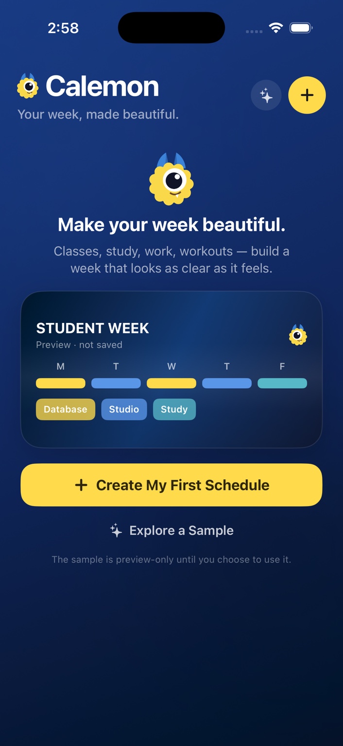
The Calemon home screen with a student week schedule.
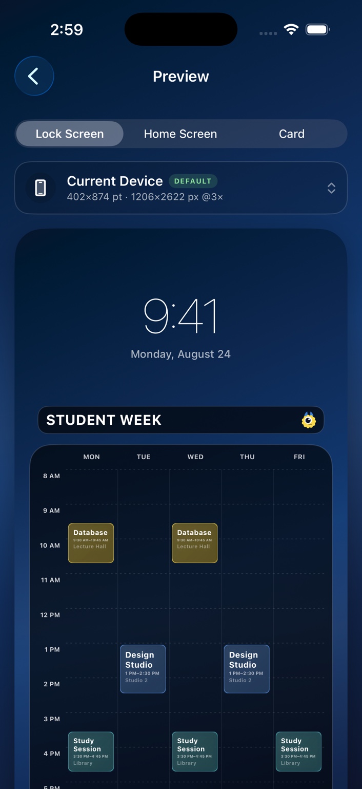
A Lock Screen preview in Calemon showing a weekly timetable below the clock.

01

Product

What it does

Build it once

Add your week, keep it where you look.

Calemon is made for recurring weekly plans. Add an item once, choose every day it repeats, and let the timetable adapt around your real schedule.

  • Add your week: classes, shifts, workouts, appointments, kids’ activities, whatever repeats
  • Make it yours with colors, backgrounds, typography, or your own photo
  • Export it as a Lock Screen, Home Screen or schedule card, in PNG or JPEG
Layout

Your schedule decides the shape.

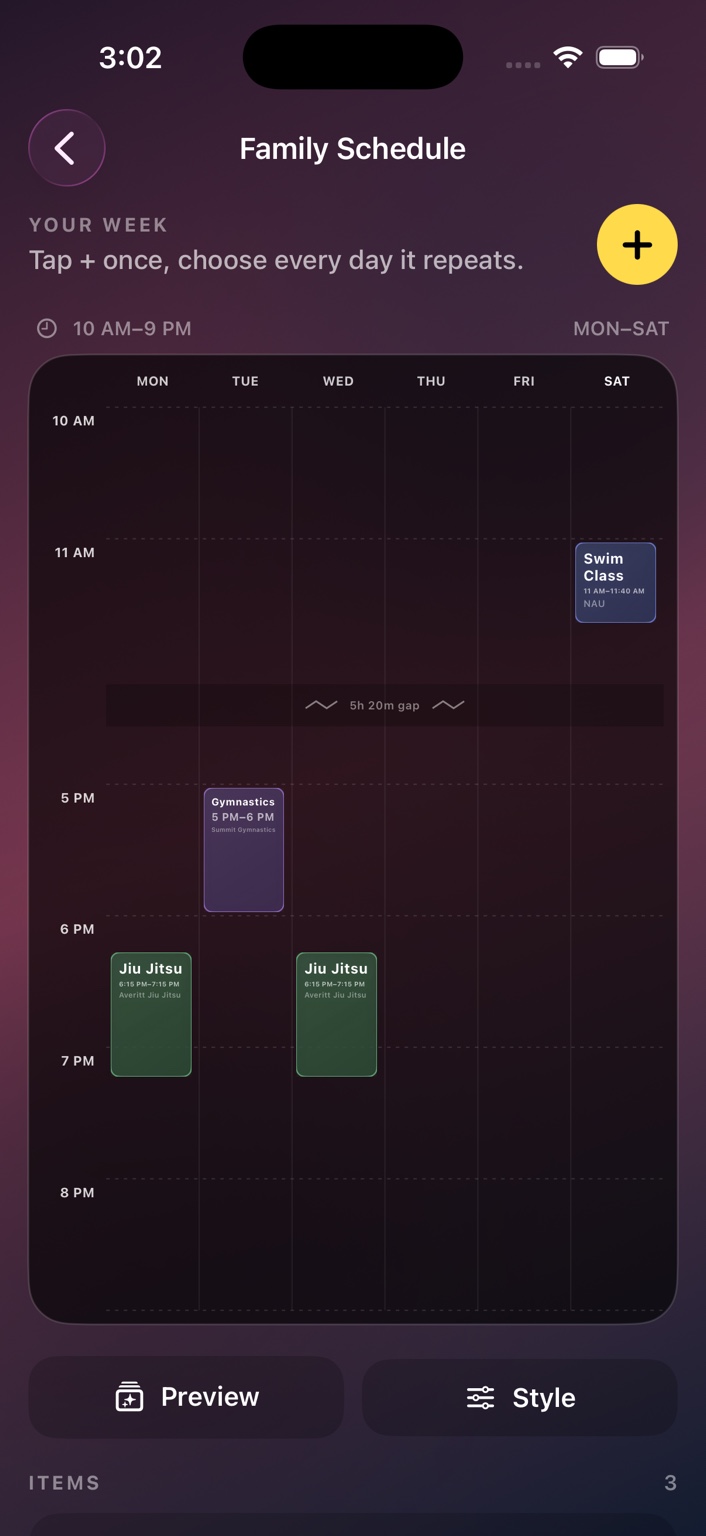
Early class? Late practice? Saturday plans? Calemon expands the visible days and the time range around what you actually added, and can compress long empty gaps so the important parts stay readable.

  • Dynamic time range
  • Weekend support
  • Gap compression
  • Overlap handling
A family schedule in Calemon with a compressed time gap.

Made for the screen

A timetable that belongs on your wallpaper.

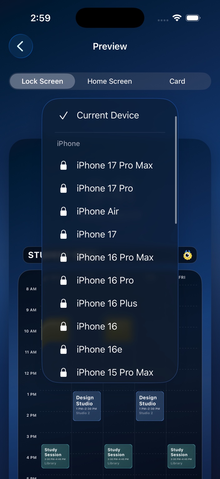
Preview your week with space reserved for the real iOS Lock Screen clock, then export a Retina-sharp image sized for your device.

The Calemon device export picker.

Calemon Plus

More schedules, more ways to export.

Calemon is free to start. A one-time Calemon Plus purchase unlocks unlimited schedules, schedule combining, premium styles, additional typography, and export presets for other iPhone and iPad sizes.

  • One-time purchase
  • No subscription
  • Unlimited schedules
  • Device presets

Private by design

Your schedule is yours.

Calemon does not require a Calemon account. Schedule data can sync through your private iCloud account when iCloud is available, and Calemon does not use your schedule for advertising.

02

Thinking

Why it behaves this way

The friction

A semester schedule repeats every week for four months. It is the most predictable information in the day, and it still got checked constantly: the room number, the building, which day the lab was on.

The question

Why should repeatedly needed information require navigation to reach?

The rule

Move the information to where it is already being looked at.

The consequence

The wallpaper is not decoration first. It has to stay readable underneath the real clock and the real notifications, which is why the preview reserves that space instead of filling it.

Still thinking about

Schedules that change partway through a term, which is the case the recurring model handles least well.

If you already look at the Lock Screen, the schedule should be on it.

03

Notes

Where it came from

The first icon idea was a lemon slice used as a day wheel. It was dropped for sitting too close to LemonBook, which is a different product with a different job, and two lemons in one small grid of app icons helps nobody.

What replaced it is a yellow one-eyed yeti standing beside a phone showing a weekly grid, on deep blue. The creature comes from the studio mark, varied enough that the app icon is not the company logo wearing a hat.

The blue is doing a job too. Calemon is the only product here that is mostly looked at rather than used, so it gets to be the most visual thing the studio makes.

Make your week beautiful, then stop opening it.